Truth Initiative
Truth Initiative is America’s largest nonprofit public health organization and is dedicated to a future where tobacco and nicotine use are things of the past.
They are most famously known for their Youth Smoking Prevention and Education program, the highly energetic and amazingly candid truth campaign.
However, their website (truthinitiative.org) was not living up to the hype. Usage was down. Content went undiscovered. There was brand confusion. After consultation calls, and RFP review, we landed on 3 experience pillars that we believed would increase usage and engagement.
Communicate Their Story
It was imperative that we communicated the truth initiative story. Previously known as the American Legacy Foundation, there was a lot of brand confusion around truth. People were unsure of the Parent/Child relationship between the two, and often confused one for the other. Our goal was to make it clear that truth initiative was and is more than just the truth campaign.
Use Innovative Visual Design to Drive Their Brand
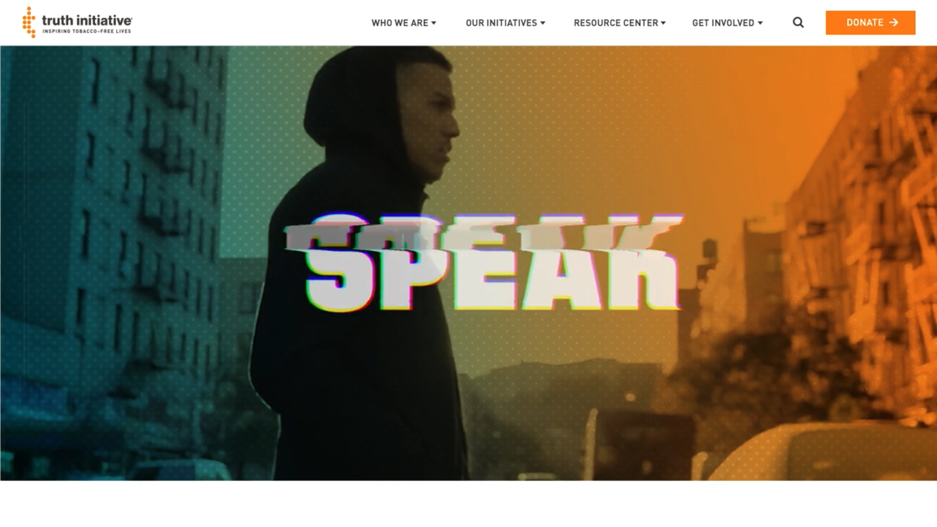
Leveraging the power and energy of the truth campaign was key to creating an innovative visual design. One that expanded on the look of the campaign, but added elements and aspects that were totally ownable, and visually distinct from the larger campaign website and brand.
Make it Easy to Use
Finally, we looked to overall enhance the user experience, not only through UI and recognizable design patterns, but also by increasing access and usage to the depth and breadth of their vast content library.
The final design captured the energy and enthusiasm of the brand and communicated their high-level brand story immediately upon load. The entire content strategy and tagging system was reengineered to be more user centric and paired with a more intuitive navigation pattern that put the right content in the right place.
And people noticed. In the first 3 months after launch, content consumption steadily rose. Site visits were up 6% and set an all-time high for monthly site sessions at 350,000. Optimizing for mobile with a seamless responsive experience led to an increase in site usage on mobile devices (+6%), and also increased the way content indexed on search engines (+8% branded search queries). More tactically, newsletter sign ups increased by 490% after we enhanced the sign-up placement, and taking a fresh look at the share icon placement helped drive to the largest number of shares ever in one month (1,908).
I think it’s safe to say while the truth is always important, sometimes how you present it can make the biggest difference.


